Workwear imprint Carhartt‘s Carhartt WIP line is known for its masterful combination of utilitarian influences with streetwear styles. As WIP continues its Australian expansion, the label recently tapped London’s Counterfeit Studio to conceptualize the design for its second Australian brick-and-mortar store, located in Melbourne’s Chinatown district.
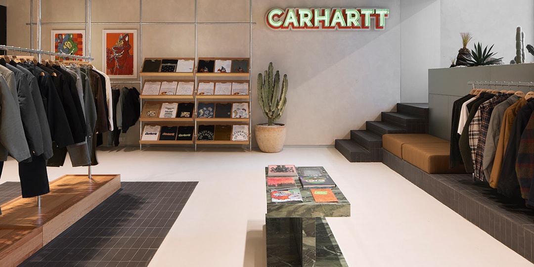
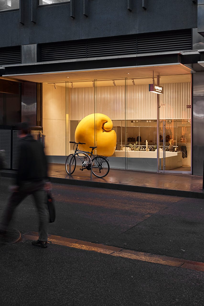
The clean yet dynamic layout sees a 3-dimensional sculpture of Carhartt’s infamous “C” logo. Dipped in the label’s signature yellow hue, the inflated structure is complete with a sleek, high-gloss finish. Step inside and WIP’s elevated utilitarian elegance comes to life – lively street art-inspired prints and pieces are scattered about, tapping into Melbourne’s local and thriving street art scene. Warm lighting is intentionally implemented as well, to create a captivating, warm and authentic-to-WIP retail experience.
View this post on Instagram
A post shared by Carhartt Work In Progress (@carharttwip)
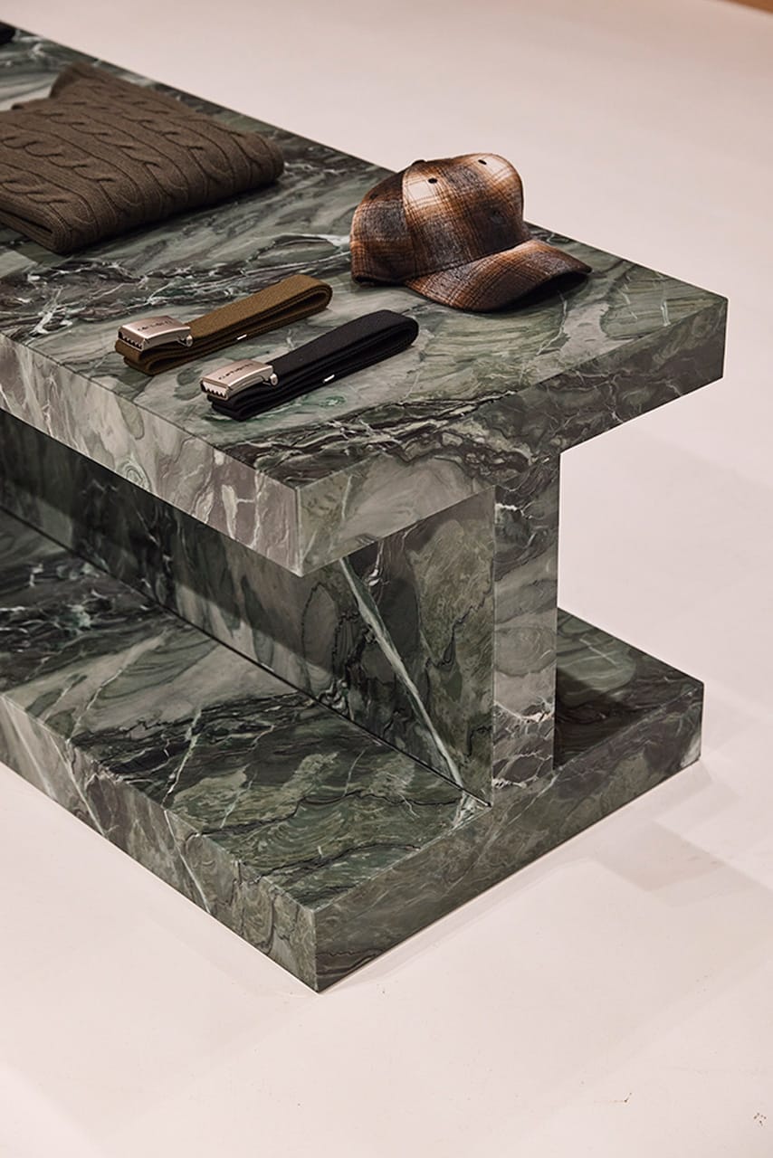
As for the bottom floor, high ceilings and concrete details curate an art gallery type of vibe, with products perched on floor-mounted rails and suspended structures. Beam structures line the interior as well, crafted from native Australian green Pilbara marble. Bespoke Carhartt speakers are intermingled throughout the lower sales floor as well, resembling the same high gloss yellow finish as the “C” structure.”1 of 2
Carhartt Wip2 of 2
Carhartt Wip
The new Carhartt WIP store will house the brand’s newest seasonal collection, as well as an exclusive tee designed by graphic artist Ed Davis and custom-branded incense sticks created by a local Melbourne-based company.
Source: Read Full Article


